


February Weather Trends in Broomfield
What we can learn from observation

Introduction
In last month’s substack, January Weather Trends in Broomfield, I discussed my background as a scientist, and I showed graphs of temperatures taken from three different sources measured at three different locations. I wanted to understand the variability in temperature measurements in Broomfield and how that has changed over time.
This month I will show the same graphs but for the month of February. I am still using the following sources: WeatherBug, Weather Underground, and The Weather Channel.
I began documenting temperatures, to ask the question, “How accurate is a 10-day prediction?” If I want to look at how the temperature changes during a 10-day period, I start recording the temperature 10 days prior to that day. For instance, to look at how the temperature for February 15, 2024 varies over 10 days, I start recording the temperature on February 6, 2024 track the predictions for the 10 days between those two dates. These are recorded in a spreadsheet. I also record the actual temperature for February 15, 2024 at the end of that day from the WeatherBug website.
Temperature Sensor Source Variability
I present data in various ways in my spreadsheet. For the first set of graphs, the 10-day predictions vs. the actual temperature are shown in Figures 1 and 2 as bar graphs. The prediction is the first recorded prediction, 10-days prior to when the actual temperature is recorded. Figure 1 shows the high-temperature predictions for the three weather sources and the actual high-temperature recorded for that day. Figure 2 shows the low-temperature predictions and the actual recorded temperature.


The WeatherBug prediction is shown by the blue bars, the Weather Underground prediction is shown by the orange bars, The Weather Channel prediction is shown by the yellow bars and the actual recorded temperature, taken from WeatherBug, is shown by black bars. The average temperature for the month is shown to the right of the graph along with the standard deviation.
The locations of the temperature sensors were shown in last month’s substack article, January Weather Trends in Broomfield. Two of them are located very near one another, these are the Weather Underground temperature sensor and The Weather Channel temperature sensor. As you can see, even the two sensors are very close to each other, their predictions can be different by several degrees. This can be due to where the sensors are located. Are they on the ground? Are they on a light-pole? Are they close to a paved parking lot? Are they in an urban area? Are they close to a runway? Are they in the grass? As I mentioned in last week’s post, even the structure that holds the sensor may contribute to the temperature. Is it painted white which reflects solar radiation? Is it painted black which absorbs solar radiation? How have conditions changed since the temperature stations were installed? Are there more buildings surrounding the sensor, are there less? All of these variables could affect the temperature, not to mention jet streams, snow on the ground, summer conditions, winter conditions, how accurate the sensor is plus many more that we could think of.
10-Day Temperature Variability
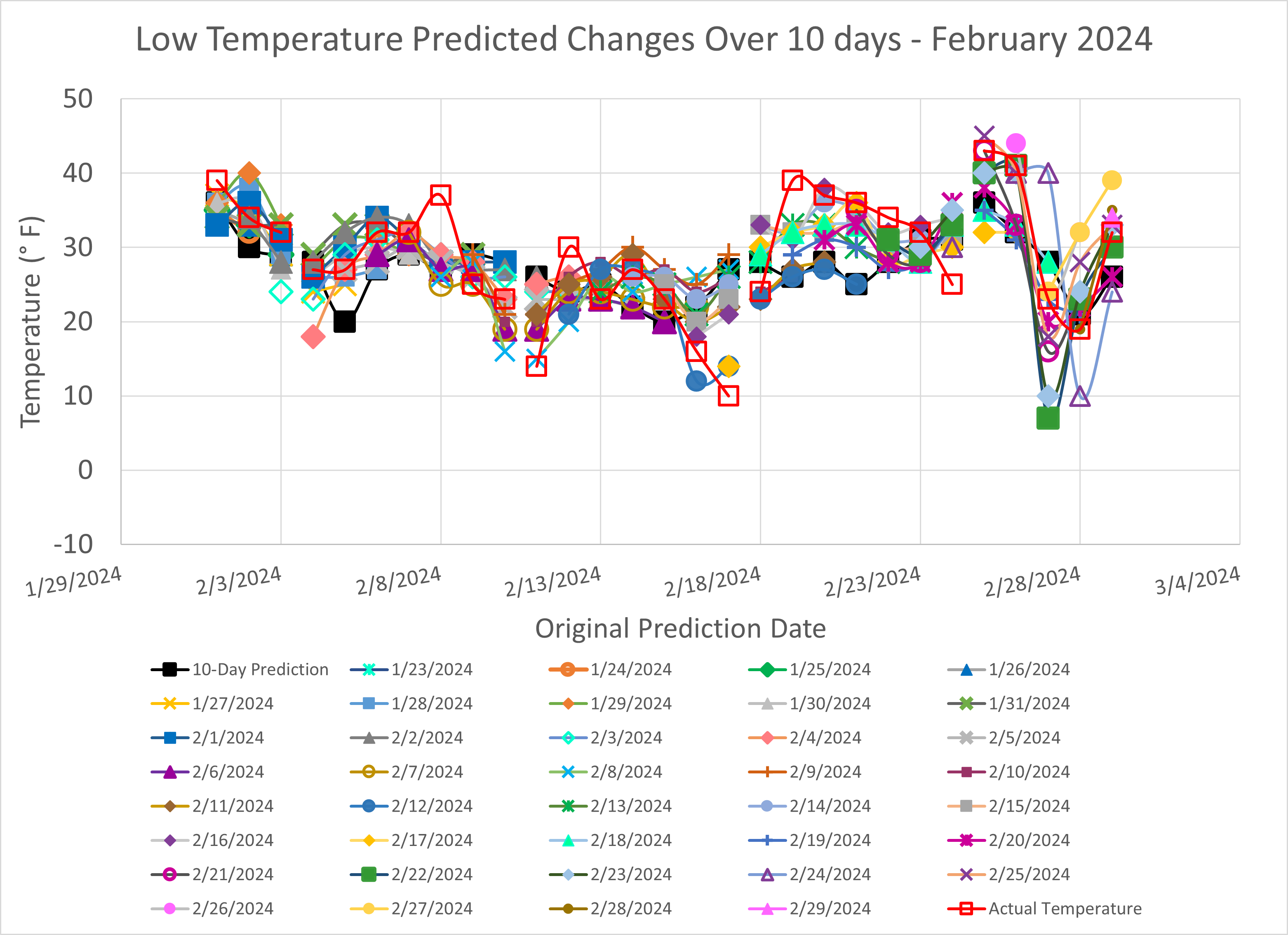
My next set of graphs show how the predicted temperature varied over the course of 10-days. I also show the original predicted temperature for that day (filled, black squares), and the actual temperature recorded for that day (open, red squares). The predicted temperatures in this graph were taken from the WeatherBug sensor as were the actual, recorded temperatures. I did this to maintain consistency.

Let’s discuss the February 6, 2024 to February 15, 2024 high-temperature, 10-day variability shown in Figure 3. The original predicted temperature for February 15, 2024 was captured on February 6, 2024 and that temperature was 33°F. The temperature prediction for February 15, 2024 changed for the next 10 days as follows: February 7 - 36°F, February 8 - 40°F, February 9 - 52°F, February 10 - 39°F, February 11 - 47°F, February 12 - 52°F, February 13 - 49°F, February 14 - 46°F, and the predicted temperature was recorded on the morning of February 15 and it was 53°F. The actual temperature recorded at the end of the day on February 15 was 46°F. So the temperature predicted on February 15 in the morning was 53°F, but the actual temperature only reached 46°F. A difference of 7°F and the original, predicted temperature recorded 10 days earlier was 33°F, a difference of 13°F.
Now, let’s discuss the February 6, 2024 to February 15, 2024 low-temperature, 10-day variability shown in Figure 4. The original, predicted, low temperature for February 15, 2024, captured on February 6, 2024 was 20°F. The temperature prediction for February 15, 2024 changed for the next 10 days as follows: February 7 - 22°F, February 8 - 25°F, February 9 - 27°F, February 10 - 27°F, February 11 - 23°F, February 12 - 25°F, February 13 - 25°F, February 14 - 26°F, and the predicted temperature was recorded on the morning of February 15 and was 25°F. The actual temperature recorded at the end of the day on February 15 was 23°F. So the temperature predicted on February 15 in the morning was 25°F, but the actual temperature was 23°F. A difference of 2°F and the original, predicted temperature recorded 10 days earlier was 20°F, a difference of 3°F.
10-Day Temperature Variability for Select Dates
We can break out a few more of these high-temperature, 10-day trends as shown in Figure 5. Temperatures can be highly variable between the original prediction and the actual, final, recorded temperature.

Original Predictions versus Actual Temperatures
How does the original 10-day prediction match up to the actual temperature recorded on that day? Figures 6 and 7 show the high-temperature and low-temperature, initial, predicted temperatures for a given date and the actual temperature that was recorded at the end of that day. The filled, black squares are the predicted values and the open, red squares are the actual temperatures, both values are taken from the WeatherBug source.


In Figure 6, on the first day of the month, we see that the predicted, high temperature of 53°F was 10 degrees lower than the actual, recorded high temperature of 63°F. On the 10th of February, the predicted high temperature was 46°F, which was 16 degrees higher than the actual recorded high temperature of 30°F. On February 20th, the predicted, high temperature was 44°F and the actual, recorded high temperature was 66°F, which was 22°F higher.
In Figure 7, on the first day of the month, the predicted, low temperature was 36°F, which was 3 degrees lower than the actual, recorded low temperature of 39°F. on February 10th, the predicted low temperature was 28°F, whereas the actual, recorded low temperature was 14°F. The predicted low temperature was higher by 14 degrees. Finally on February 20th, the predicted low temperature was 28°F, which was lower by 9 degrees than the actual, recorded low temperature of 37°F.
The variability between prediction and actual temperatures can be a significant. If we look at the average and standard deviation that is shown in Figure 1 and 2, we see that the standard deviation can be almost 25% of the average for the high temperature and nearly 50% of the average for the low temperatures. The actual, recorded temperatures for February have a higher standard deviation than the predicted values.
High- and Low-Temperature Histograms
The high- and low-temperature histograms are shown in Figures 8 and 9.


The predicted 5-degree temperature bins are shown by the blue bars, the actual 5-degree temperature bins are shown by the gray bars, the predicted, average temperature, calculated from the prediction data, is shown by the orange dot, and the actual, average temperature, calculated from the actual temperature data is shown by the yellow dot.
Temperature Variability for Select Years since 1981
In the January Weather Trends for Broomfield substack, I discussed the source used for the following graphs shown in Figures 10, 11, and 12. These temperatures were downloaded from the PRISM Climate Group database, for the following years: 1981, 1985, 1991, 1997, 2003, 2012, 2018, 2021, 2022, 2023, and 2024. The datasets for 2023 and 2024 were the data I recorded from the WeatherBug source.

In Figure 10, we see that some of the lowest, high-temperatures occurred in 1985, 2021, 2022, and 2023. February, 2024 high temperatures varied from a high of 66°F to a low of 30°F. The highest, recorded, high temperature was 72.7°F in 2003 and the lowest, recorded, high temperature was 2.2°F in 2021. The average high temperature for all these years is 44.9°F. We can see that the temperatures vary around that average by 30°F to 40°F.

In Figure 11, we see that some of the lowest, low-temperatures occurred in 1981, 1985, 2003, 2021, 2022, and 2023. February, 2024 low temperatures varied from a high of 43°F to a low of 10°F. The highest, low temperature was 43°F in 2024 and the lowest, low temperature was −12.6°F in 1985. The average low temperature for all these years is 19.1°F. We can see that the temperatures vary around that average by 20°F to 30°F.

The mean temperature, shown in Figure 12, is an average of the high-temperature and low-temperature for the day. We see similar trends as in the high- and low-temperature graphs shown in Figures 10 and 11.
Just as we showed the average temperatures from 1981 to 2024 in the January Weather Trends for Broomfield substack, we will do this for February. We will also include the linear least-squares fit to each dataset and a trace showing the moving average for 5 days. This is shown in Figure 13.

The average high-temperatures from 1981 to 2024 are shown by the red trace, the average, mean temperatures from 1981 to 2024 are shown by the yellow trace, and the average, low temperatures from 1981 to 2024 are shown by the blue trace. The linear regression line is shown by the straight dotted lines shown in the same color as the average temperatures, and the 5-day moving average data is shown by the darker colors in the same color scheme and are the dot-dashed lines for each of the temperature trends.
The equation for the linear-regression line, along with the R-squared value is shown by the trend line. The R-squared values for each of the lines are very near zero indicating that a linear regression doesn’t give us the best fi t to the data. The 5-day moving average data shows a finer trend within the data and other linear trends could be taken from these localized, temperature trends.
As I look at these data sets, I see that the high-temperatures for the years since 2021 are trending upward. The temperature in 2024 lower than some of the previous high temperatures recorded in 1991, 1999, 2009, and 2017. The low temperature for 2024 is the highest we’ve seen since 1981, which pushes the mean temperature upward. The linear trend lines show downward movement since 1981 for the high-temperature data and nearly flat for the low-temperature.
Just as in January, it appears as though the temperatures in Broomfield vary from year to year with no periodicity. This data tells me that predictions vary within a 10-day time frame, and it would be difficult to develop a simple climate model from this data.